I don’t know about other authors, but for me the moment when a book becomes “real” (and not just a story floating around in my imagination) is when I see the artwork for the book cover.
Ever wondered what the book cover process looks like from the author’s perspective?
It starts with cover concepts from the editor.
 Last fall, while I was still writing the manuscript, my editor sent me two variations of the cover and asked for my opinion.
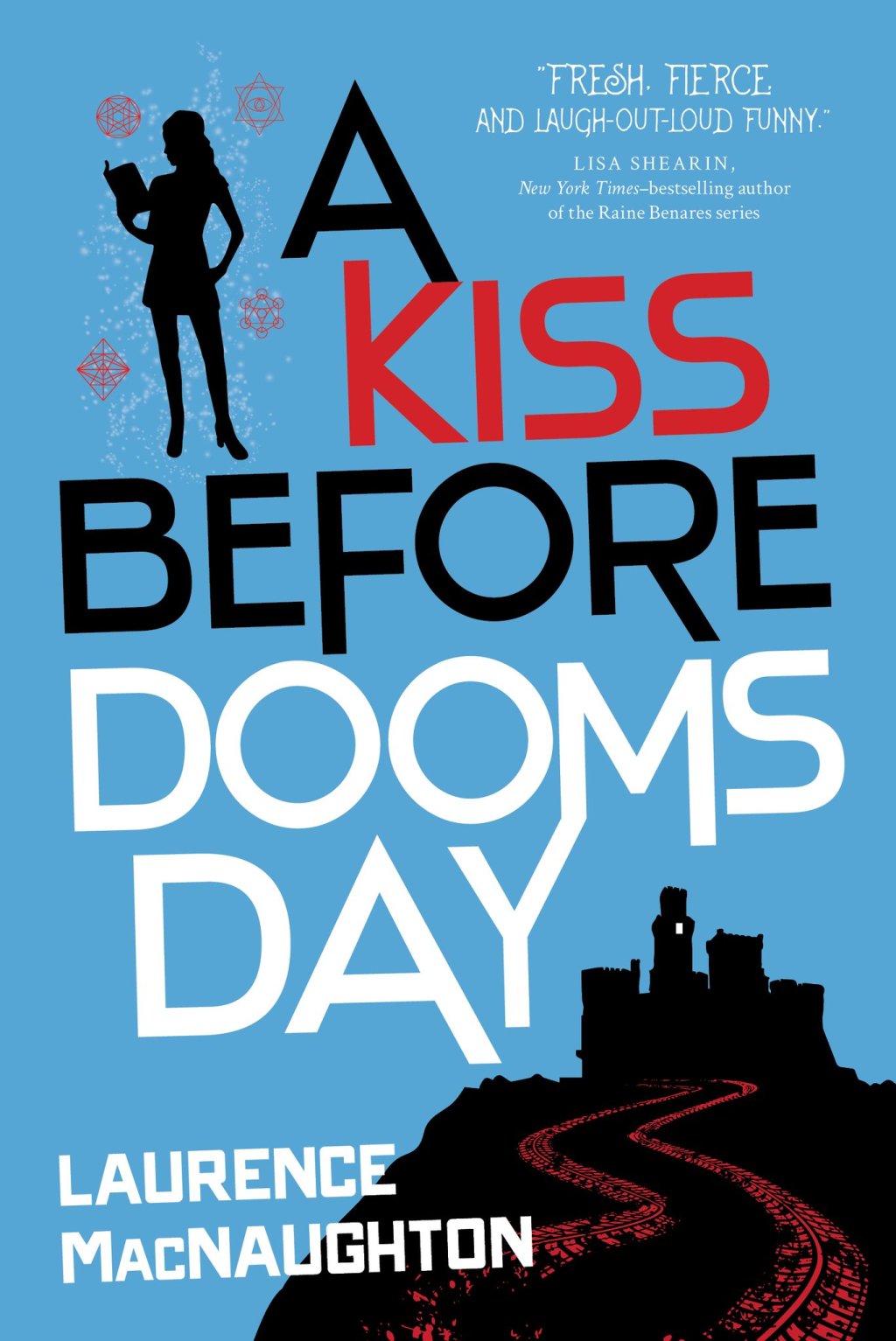
They had decided that in this book, only Dru should be on the cover, not Greyson. (If you haven’t already read Book 1, I won’t spoil the end for you, but I will say this: it’s not exactly a Disney ending for our guy Greyson.)
However, they did want to imply that Hellbringer is back on the road by including tire tracks. And not just ordinary mortal tire tracks, but glowing red tire tracks of doom. Oh yeah!
 (If you haven’t read Book 1 yet, Hellbringer is a 1969 Dodge Charger Daytona possessed by a literal speed demon. Which leads to the most “hellish” car chases ever.)
The biggest thing I love about these cover concepts is Dru’s new sassy silhouette. Also, I love the magical sparkles and cryptic circles floating around her. They add a fun comic-book feel that just screams “MAGIC!”
Uh oh. Problem…
So here’s the thing.
 As much as I loved the publisher’s original concepts – the dark blue cover and the gray cover – I was worried about them from a marketing perspective.
Today, the majority of book sales are actually made online rather than in bookstores. A book cover will be seen many more times online than it is in the actual brick and mortar bookstores.
So if you think about it, these days a book cover is very much like a button on a website. Because that’s how it functions. You click on it to get the book.
Ever notice that when a web page presents you with several buttons, the free or less-desirable option is usually grayed out?
There’s a reason for that. Gray buttons tend to fade into the background, so visitors are less likely to click on them. Instead, they usually click on the brightly-colored button next to it.
Marketers know these things. It’s like a superpower.
Anyway, as classy and subtle as the gray cover is (and many people told how much they love it), the last thing I want to do is send the message that my book is the less-desirable option.
So. What to do?
Bright colors!
 The fire-engine-red cover of the first book got a lot of attention. Obviously, we couldn’t pull the same trick twice, so I looked for another bright color to use.
I ran the cover concept through a bunch of different filters, swapping colors, reversing colors, trying all sorts of things. I ended up with quite a few eye-popping combinations that left me momentarily blinded.
But there were a bunch of results that I personally liked. I ran them past my team of trusted advisors (otherwise known as the few friends who will return my emails late at night) and we narrowed it down to a blue or an orange background.
Ultimately, the publisher picked the blue cover, and I couldn’t be happier.
Oh, one last thing: I asked my editor if there could be a single light shining from a window high in the evil fortress.
And (probably with a much-deserved eye-roll) she said yes.
Yay!
And that’s how the cover happened. The end.

Leave a Comment